Alana Vaccaro

🏠 Back to home

Project Duration:May-June 2019
Role:Product Design

BaseHubs

A mobile application that serves the military community

Overview

BaseHubs(previously Valor Worldwide) is a media company that provides information to the military community. BaseHubs acquired Vermouth, a mobile app that allows you to share your favorite places with people you know in a pinterest—esque way.

Our goal for the new mobile app design was to reimagine Vermouth with the military community in mind. The military community is underserved and lacks resources catered specifically to them. With the new mobile app, military members can access information about their base and surroundings based on other community members' experiences and recommendations.

In this project, I worked closely with BaseHubs’s team as the only Product Designer to build the MVP in preparation of the app launch in November 2020.

How it works

Understand

Business

Stakeholder Interviews

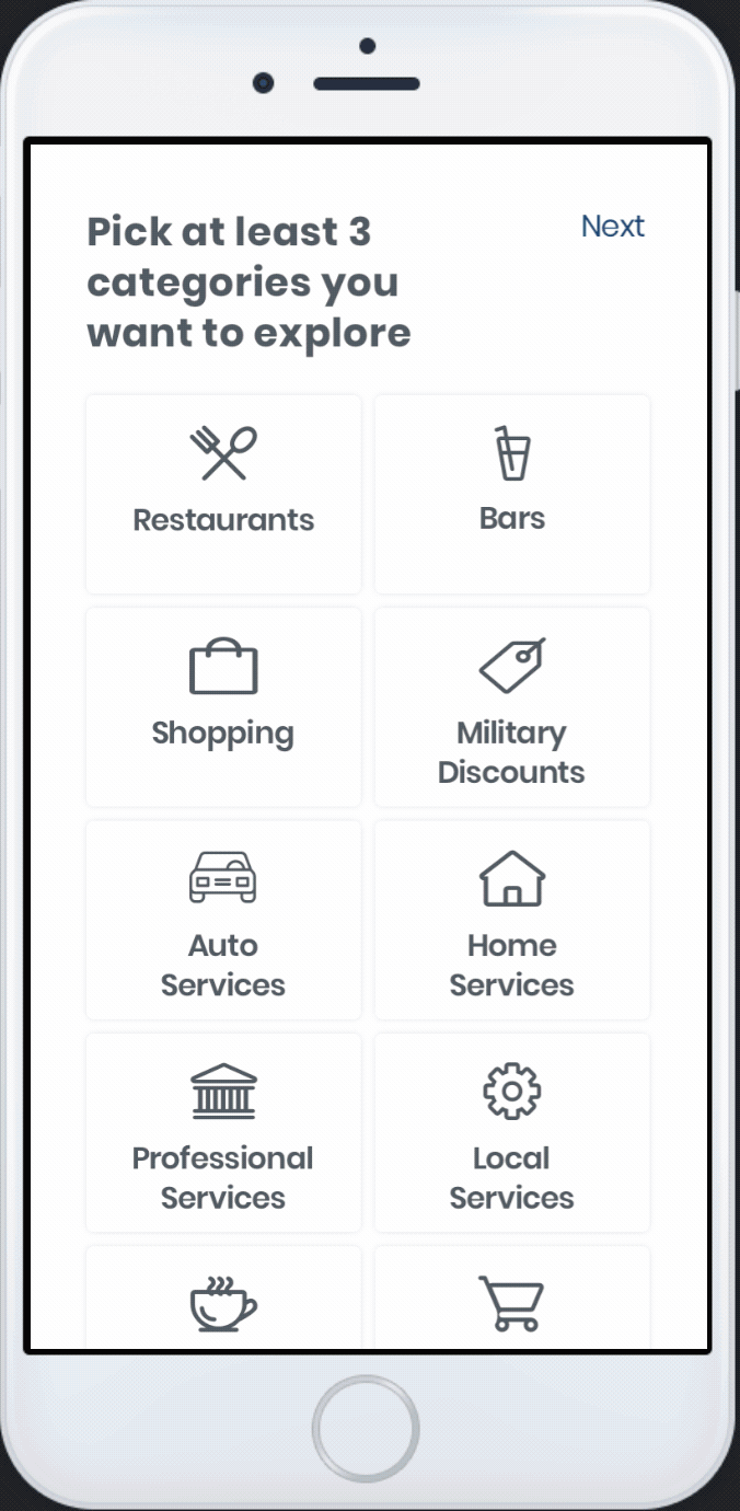
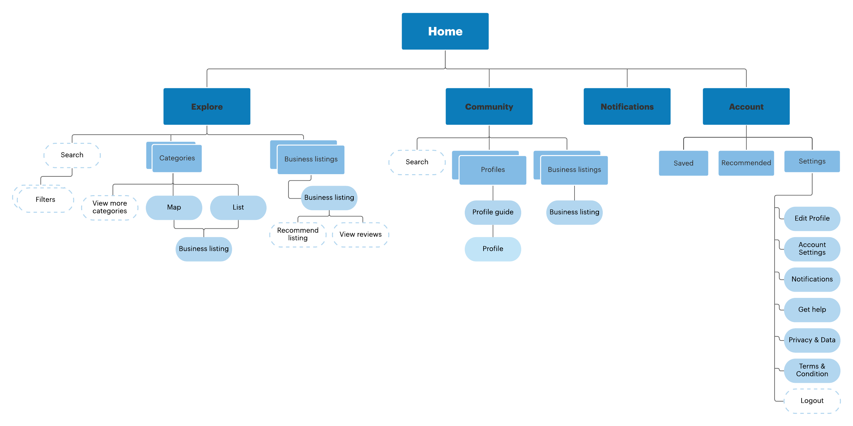
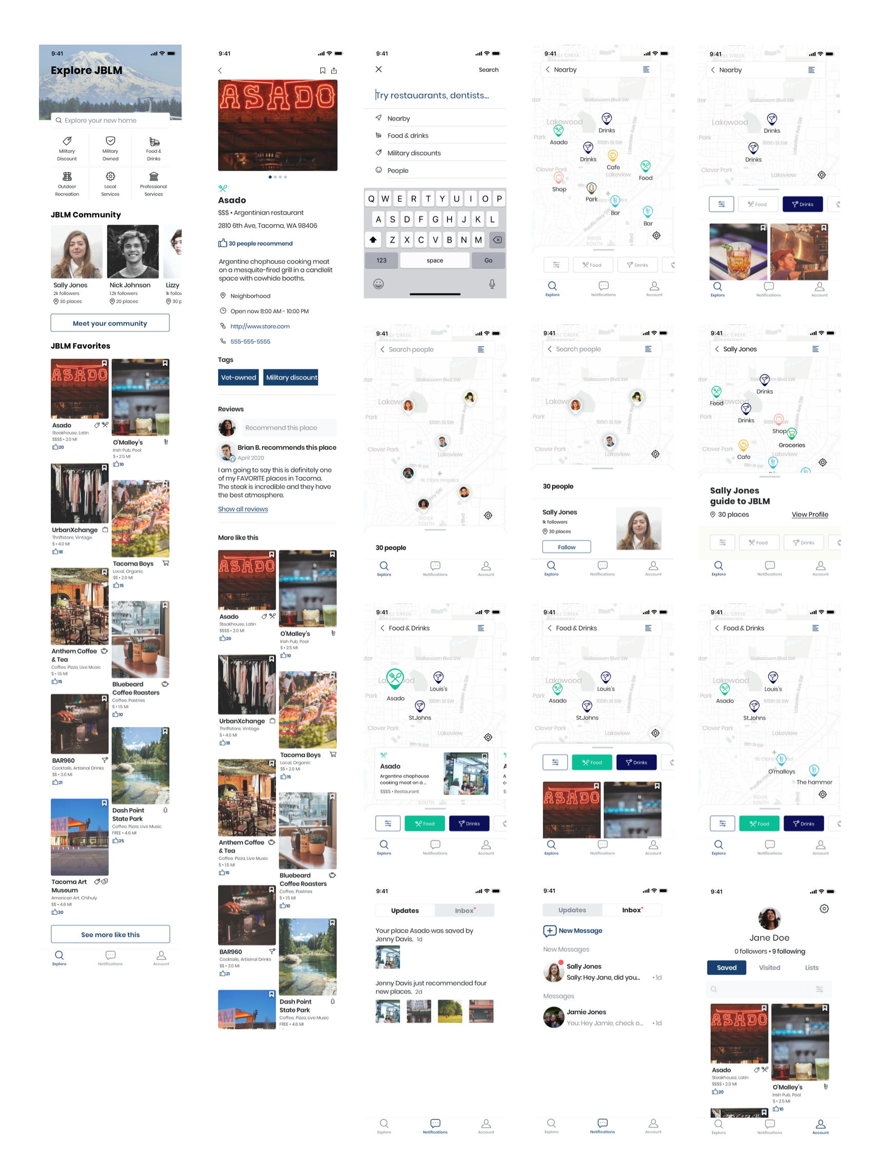
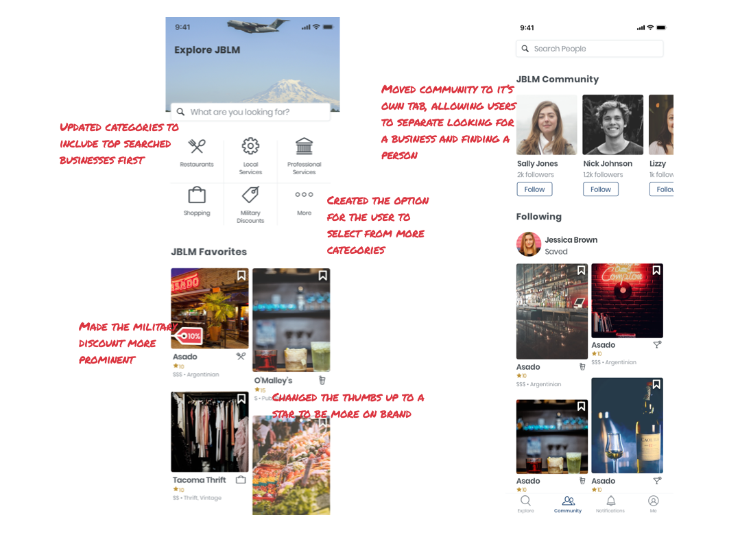
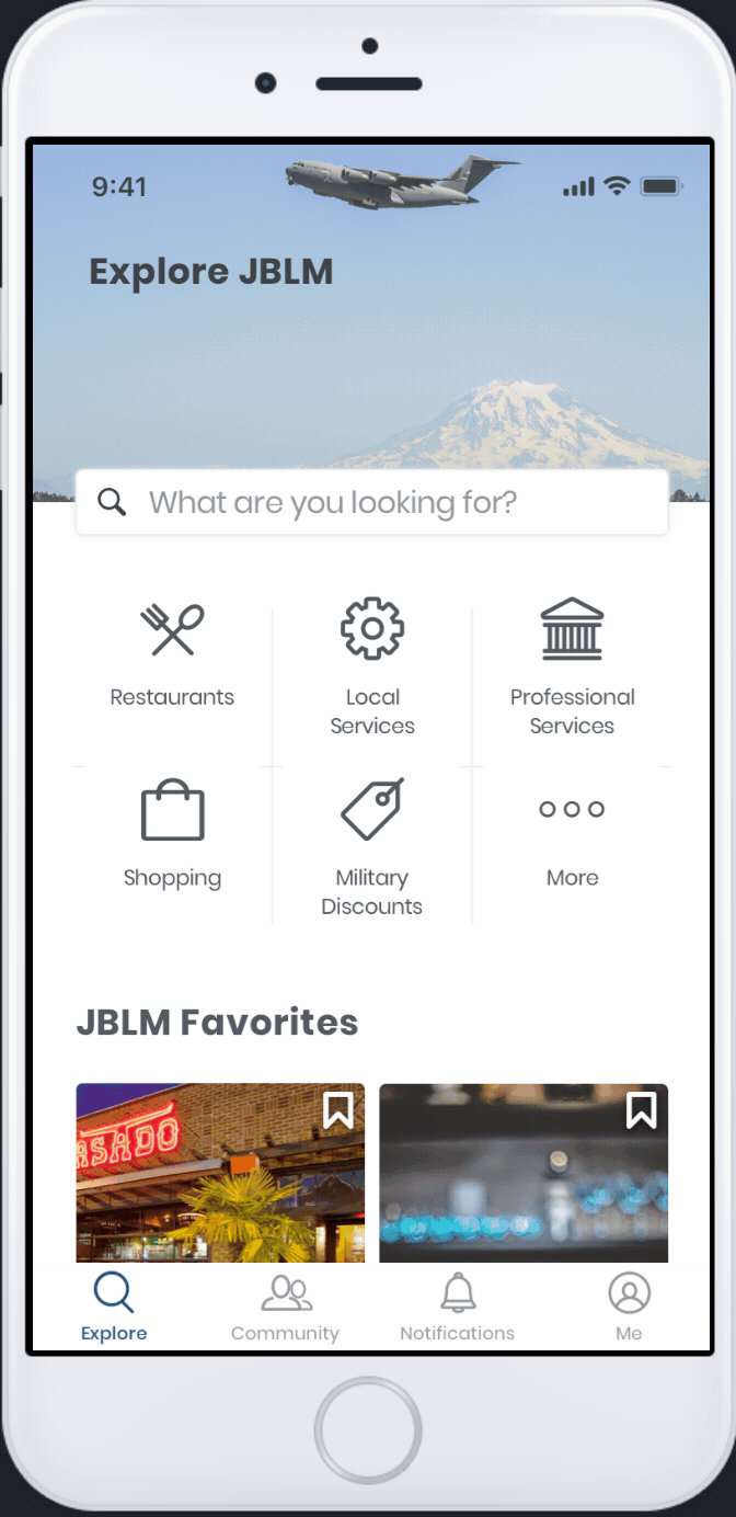
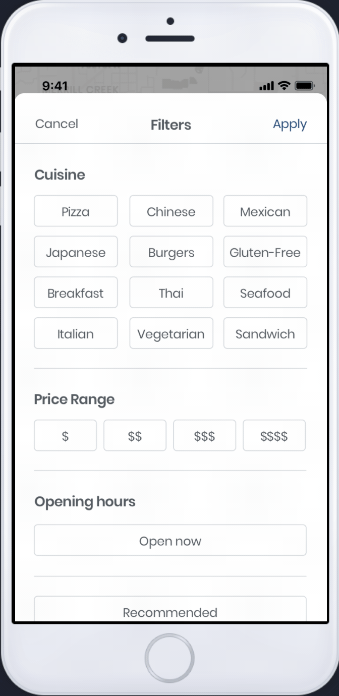
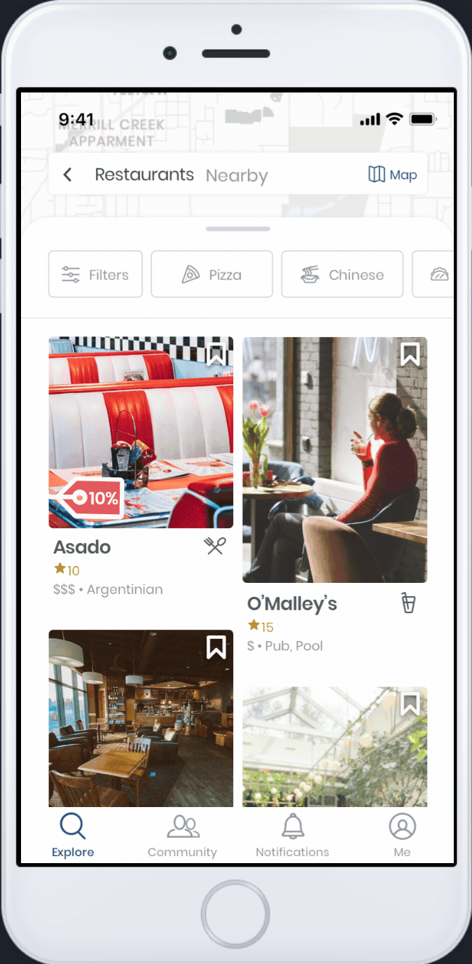
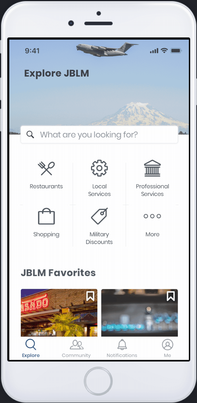
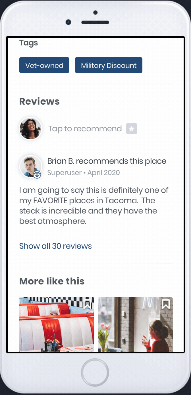
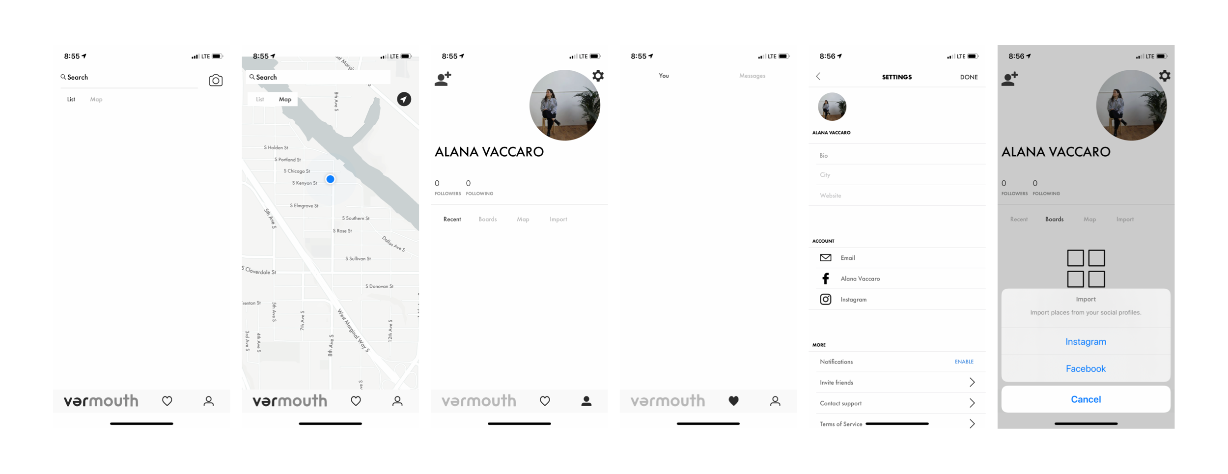
To begin the project, I analyzed the summary of needs for BaseHubs. This meant understanding the business requirements and learning what key features they wanted to include. This gave me a better understanding about their customer. I also analyzed the existing application to learn what aspects needed improvement. The original application followed Pinterest very closely, but the updated version would have significant changes to the UI.

Original Application

Throughout the design process it was very important to consider BaseHubs's business model:develop a tool where companies can promote their business and services.

Use Case

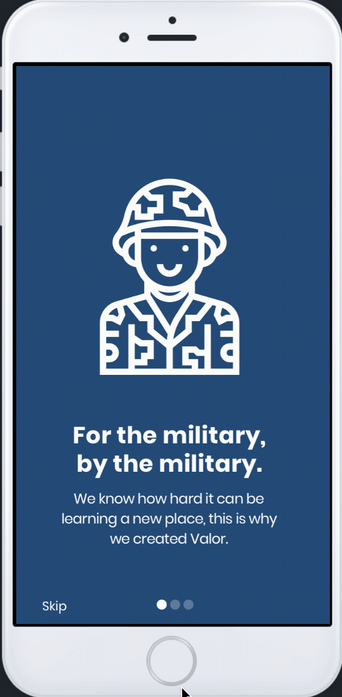
Military families move frequently (every 18-36 months, typically). This means there is a need to quickly acclimate to new communities. The sharing of information today is both informal (relying on those families who have been in the base community) and formal (welcome activities and information packs for families that have recently PCS'd (Permanent Change of Station) to a new base. The app will serve as a dynamic tool for providing and sharing information, finding community resources, and finding businesses that support the military (through discounts, coupons, etc.)

Qualitative Research

User Interviews

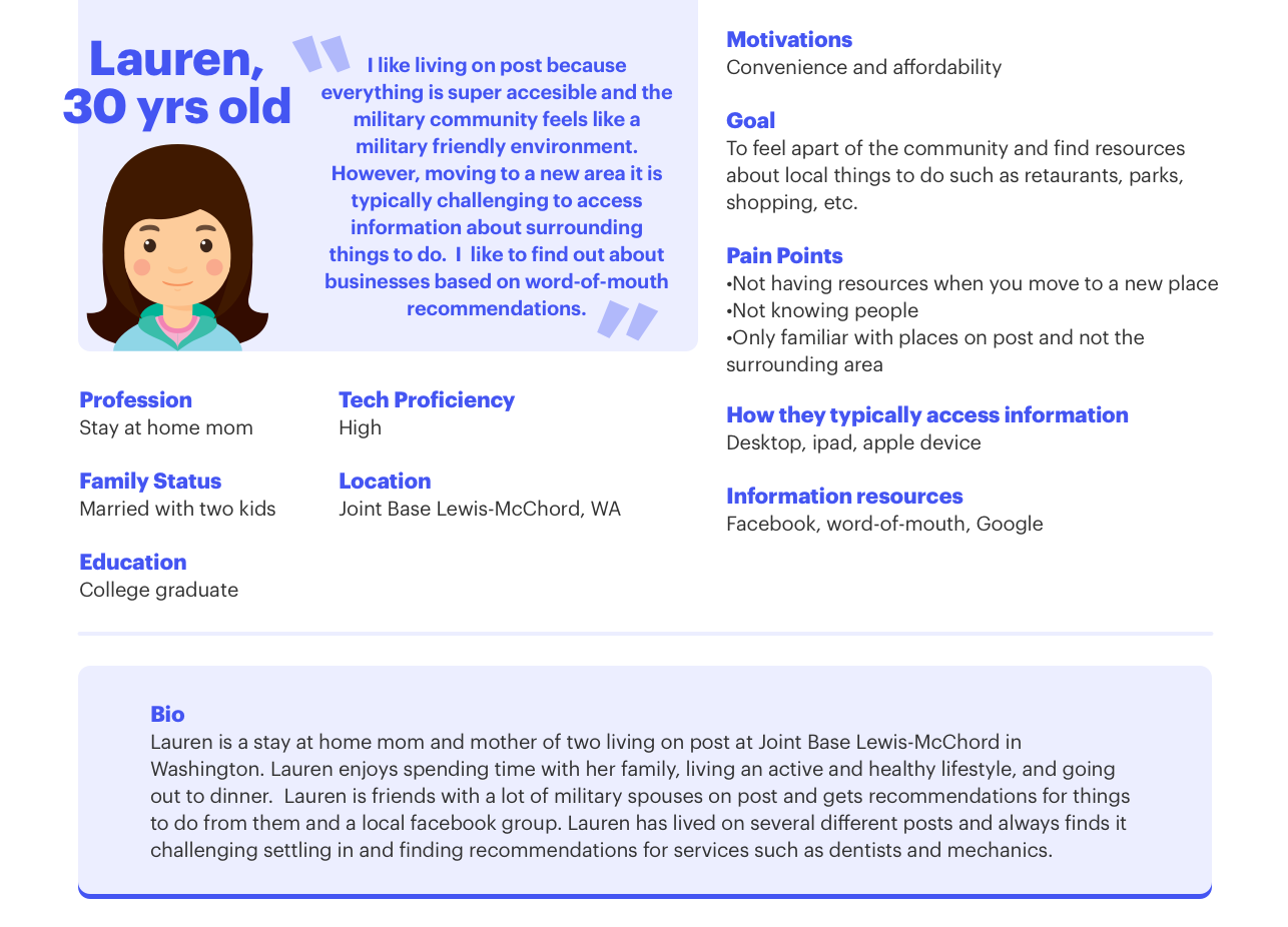
With the busines model in mind, it was now time to get a better understanding of the customer. I interviewed three women ages 37, 28, & 26 who were all military spouses. The women were either currently living on post (living on a base) or had previously lived on post. The three women would act as Valor's "super user", essentially influencers for the mobile app.

I scheduled 1 hour long zoom interviews where I could perform qualitive, open-ended question interviews to gain a better understanding of what they were looking for and expected from the app. I also explored their current challenges accessing information about services at their posts and in the surrounding areas.

During the interviews, I gathered information about their demographics, experiences living on post, goals for the app, & current likes and dislikes for other applications they use to find information.

Define

Problem Statement

Military families move frequently. This means there is a need to quickly acclimate to new communities. The sharing of information today is both informal (relying on those families who have been in the base community) and formal (welcome activities and information packs for families that have recently PCS'd (Permanent Change of Station) to a new base.

Solution Statement

Be redesigning Vermouth to suit the needs of military families, our goal is to reduce the stress of moving to a new place by providing a directory of businesses and activities in the area. By creating a feed filled with local businesses, users are able to follow other people and get recommendations.

User needs

Persona

From my interviews, I was able to develop my persona Lauren.

Actionable Insights

Based on the needs from our persona Lauren, I was able to understand the goals for using the app and what the current pain points were.Lauren needs an app that will save her time and allow quick access to information about businesses based on convenience and recommendations. The app needs to include several key features:

Filter

Convenience was very important to the user. Adding the option to quickly filter by the business, location, and price would allow the user to save time.

Location-based

By having the ability to quickly select nearby, the user is able to quickly access all listings within their area, and allow the user to save time.

Recommendation

By having the ability to connect with their local community, the user is able to see listings based on recommendations. This allows the user to feel like they are choosing a trust-worthy recommendation.

Ideate

Brainstorm

Competitive analysis

I conducted a competitive analysis of other mobile apps and websites that offer similar services. Additionally, I looked at community-based apps to see how they are organized and display information. Some of the services I compared were:Pinterest,Yelp,AirBnb,Offerup,Groupon.

Ideas

After analyzing competitors,the existing structure of Vermouth, and requirements for the redesign, I began to sketch out the user flows. I focused on the onboarding flow and finding a business flow.

I quickly sketched out some ideas of what should be on the home screen. Vermouth originally had a list/map toggle menu on the home screen. Since the idea of the app is to follow people and essentially create a yelp/pinterest, I decided to do some explorations of following a similar pinterest layout with a toggle menu of "for you" and "following", and then creating a tab bar item with the map as its own view.

My thoughts behind this were that the list view and map are completely different. List would be more of the social aspect, where as the map feature would allow the user to find businesses quickly in their surrounding area. We could then have flexibility with a top navigation menu that allows the user to toggle between "for you", "following", and then different tags such as "restaurants" "shops" "special events", etc. Then in the map tab, it could be strictly location based and allow a user to explore what is around them.

User flows

The onboarding flow has several key aspects:

  • Military Verification
  • Account creation (email & password)
  • Username/ name (how can people find each other, do we request phone numbers?)
  • General information about the user to help curate the feed (gender, marital status, children) &
  • Curating feed (selecting categories, influencers, and finding friends)

Once the user completes the onboarding process, their main goal is to find a business. They can access listings three main ways:

  • Search
  • Select from categories
  • Select from curated feed

Execution

Framework

Information Architecture

Guidelines

Branding

I kept the existing palette of navy, gold, and red for the app. Even though the mobile app offered a different service than the website, the boldness of the colors adhered to military branding.

Lo-fidelity

Sketches

I worked out the different layouts on paper, visualizing how a user would interact with the app. Originally, we discussed having five tabs: home, map, search, notifications and account. We were challenged with what the main goal of the app was: a social app that users would use to connect with their community or a quick way to search for a service. We decided to scrap five tab items and combine the search with the map. This posed a new challenge:how do we let users know they can search for people?

Wireframes

In the first iteration, we created a home screen similar to Pinterest where it was a curated feed where the user could toggle between "for you" & "following". After further discussion, we decided we wanted wanted to go in a different direction. The feed on the explore page is curated based off of people you follow so there was no need for two item navigation. We also wanted to add the ability to quickly access different categories such as: military owned, military discounts, food & drinks, outdoor recreation, local services, and professional services.

Since it was an application that combined a directory with a social aspect, I looked at ways I could make the community part more prominent.

Hi-fidelity: Iteration 1

I created a 3-item tab bar: explore,notifications,and account. I combined the explore tab and the home tab into one, allowing the user to quickly access the feed, search capability, categories, and the community aspect.

Validate

Qualitative

Usability Testing

For my usability testing, I used Maze to conduct remote usability tests. I gave the users a mix of tasks,open-ended questions, and opinion scale questions to gain an in-depth understanding of the user's challenge with each task. I asked the user to complete the following tasks:

  • Sign up for an account and complete the onboarding flow
  • Discover food and drinks in your area
  • Recommend a restaurant
  • Search for Sally Jones
  • Filter your search
  • Find the settings page

User feedback

In addition to the results from Maze, I followed up with the users and asked some open-ended questions to learn about their experience. For the most part, users were able to complete each task without any challenge. From the research, I was able to conclude the following:

  • Military-owned and Military Discounts were not priorities, but rather convenience was the main priority
  • The ability to search for people should be separate from the feed because it feels like two different actions

After the first round of usability testing, I updated the app with the insights I learned. I decided it was better to go back to four tabs, but this time making the community aspect its own distinct tab item. With the updated layout, I completed additional rounds of usability testing. During the usability testing, I had higher success rates for the user's completing each task with 0 testers dropping off and a 100% completion rate. I discovered that most issues the user ran into were not necessarily flow related, but prototype related.

Final

Hi-fidelity

Onboarding

Searching nearby

Adding a filter

List/Map toggle

Community

Leaving a review

Reflection

This project was really fun and I thoroughly enjoyed being able to completely reimagine the original app to suit the needs of the military community. If it wasn't for the ability to be able to conduct the research myself and speak with the users, I don't think I could have have ended up with the final product I did. Learning the user's goals and pain points allowed me to balance the user's requirements with the business’s.

Although this was only the MVP, I am very proud of it. I would like to thank my team for their involvement throughout the whole process. My goal for this project was to include everyone in each step, gather feedback, and incorporate the team's input into the design. This allowed us to design the app in a short-period because everyone was a part of the decision process.

This app is expected to launch in November and I am extremely excited! I can't wait to hear feedback about people's experiences using the app.